PRENETICS
CircleDNA Mobile App
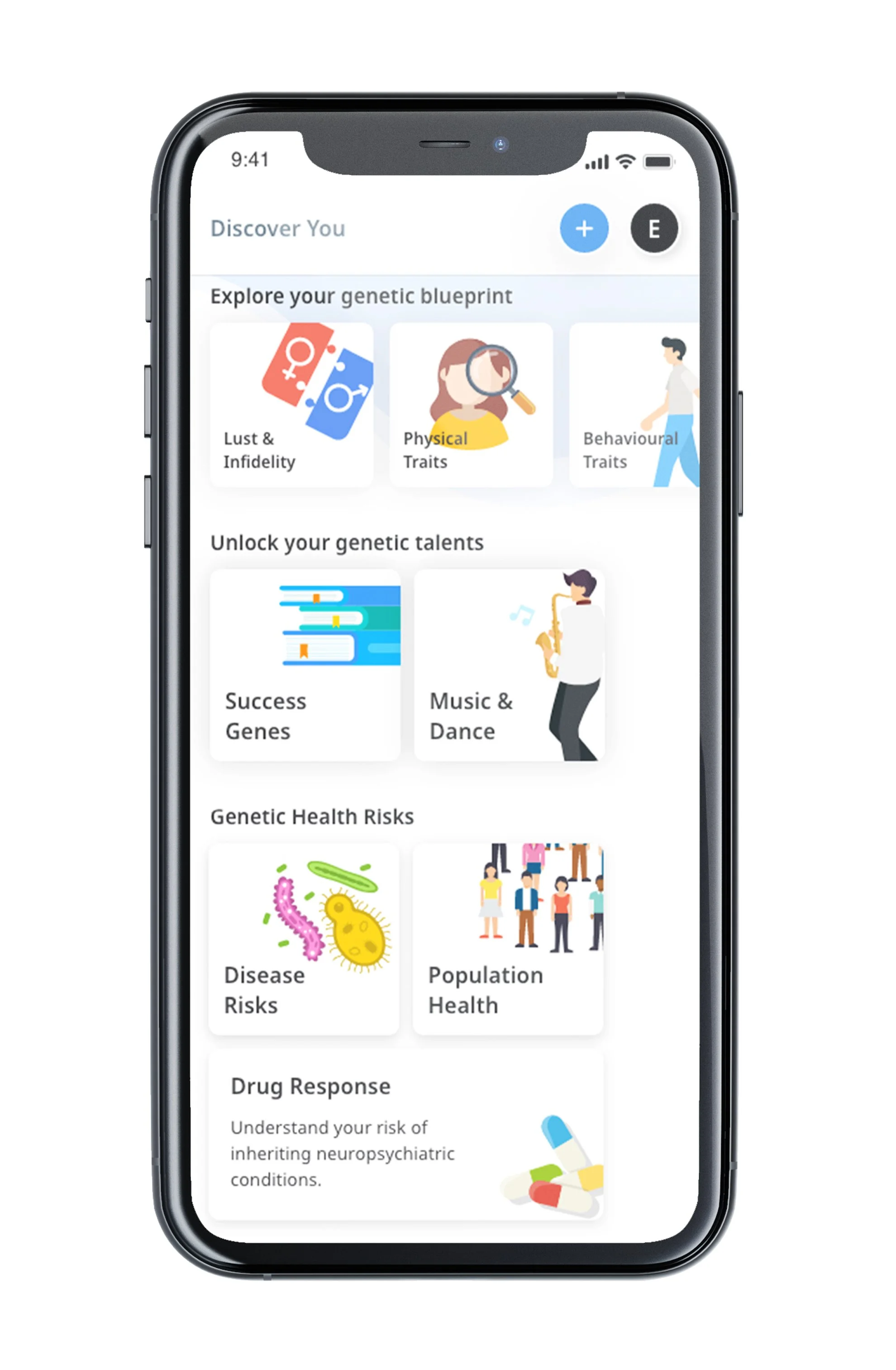
CircleDNA is one of Prenetics flagship products and is the world’s most comprehensive at-home DNA test. When the results are ready, they will be shown on the CircleDNA mobile app. Its Premium plan contains all 20 categories ranging from discovering your optimal health, personality traits, disease risks, and more. It has a combined total of of 500+ reports. CircleDNA’s mission is to empower individuals with valuable health insights so that they can live a healthier life. After all, knowledge is power.
Role
Lead designs for new feature rollouts on the CircleDNA mobile app. Conversion rate increased by 28.7% for users upgrading from a Standard plan into a Premium plan after the revamp.
Responsible for discovery & ideation, design, usability & testing, prototyping, support through development
Team
1 Product Lead
1 Business Analyst
2 Developers
Platform
Mobile App
Let’s Start
What are the business goals?
Increase conversion rate of users upgrading from a standard plan to a premium plan
Release the Report Summary feature to increase social media engagement
What are the product goals to achieve that?
Goal No. 1
Revamp the mobile app’s dashboard
Goal No. 2
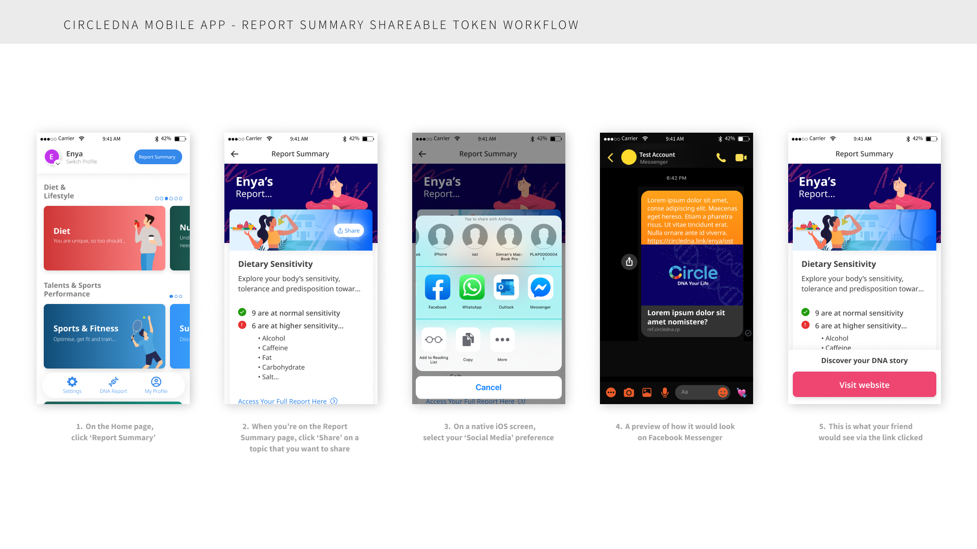
Design the report summary into shareable social media-friendly tokens
Goal No. 1
Revamp the mobile app’s dashboard
What are the problems?
Starting off with the UI:
There was inconsistency in: graphic sizes, graphic placement, font sizes, and card component sizes
Not all cards have a description which is another inconsistency
The UI design lacks uniformity and hierarchy
As for the UX:
Low orientation due to navigation
It’s challenging to navigate to different sections and pages.
Top navigation isn’t intuitive enough to inform users on what actions can be done
Lack of organisational structure
Clicking on the profile icon has too many actions. This leads to confusing the user on what its primary function is, which is to simply switch profile(s). The CTAs available when clicking the profile photo were: add a new profile, purchase kits, view/edit profile, switch to another profile, and manage account settings. Too many options.
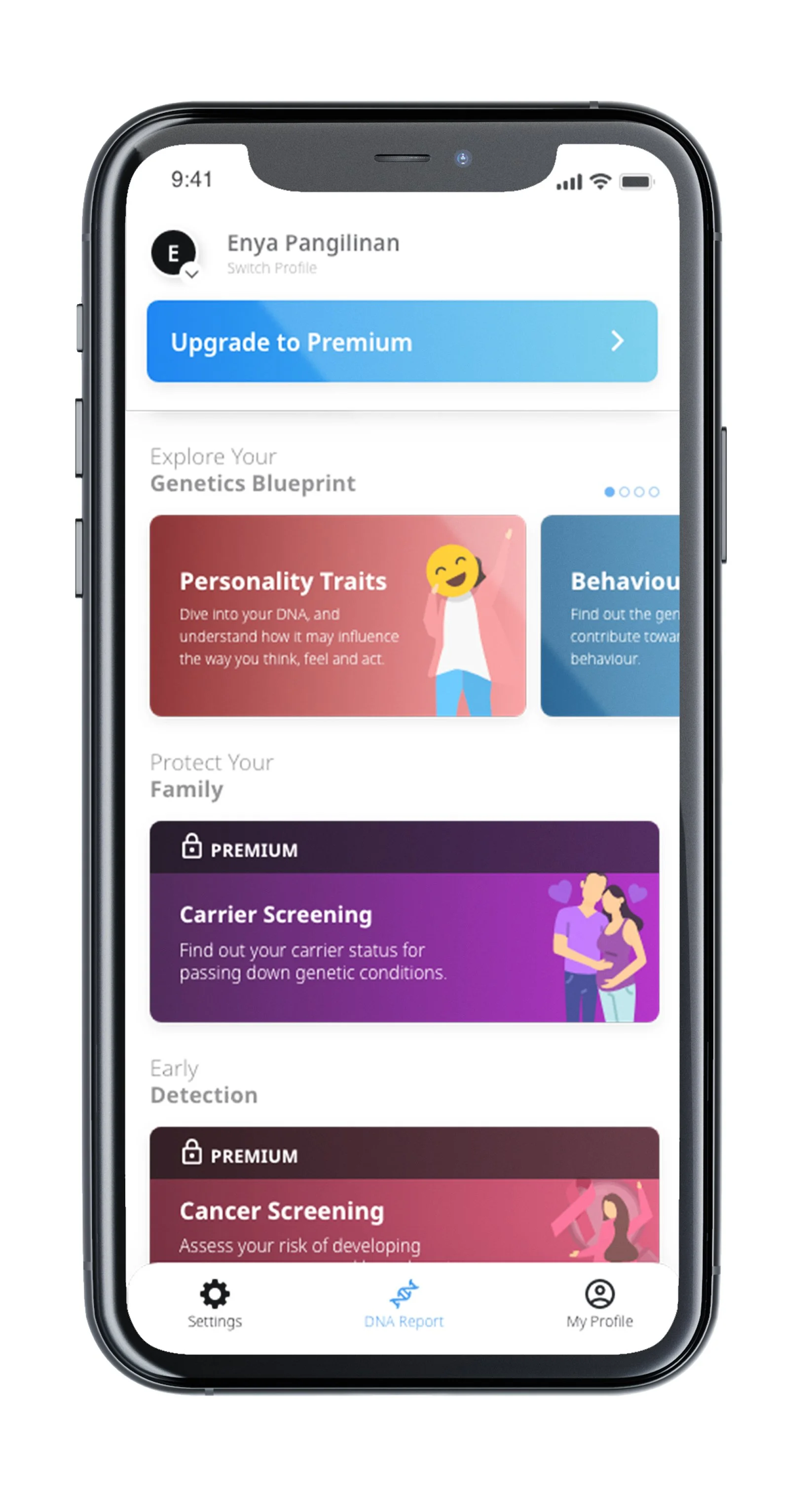
Missing the potential of highlighting what non-Premium plan users are missing out on.
Premium plan contains 500+ reports and for users that did not purchase a Premium from CircleDNA, the reports on the app will only show the topics that are included in the plan they purchased (e.g. Vital plan with 125 reports; Family plan with 115 reports).
What are the changes?
For the UI:
Incorporated consistency
Incorporated consistency in font styles, graphic sizes and placement; and component card sizes.
In order to add more colour into the dashboard without taking out the focus on the content, a gradient colour scheme that matches the graphic inside the tile component has been used.
Limitation: Due to the urgency for an updated app to be released, the new design should be simple and easy (rather than a design overhaul) to be implemented by the engineering team so graphics needed to be reused.
For the UX:
High orientation
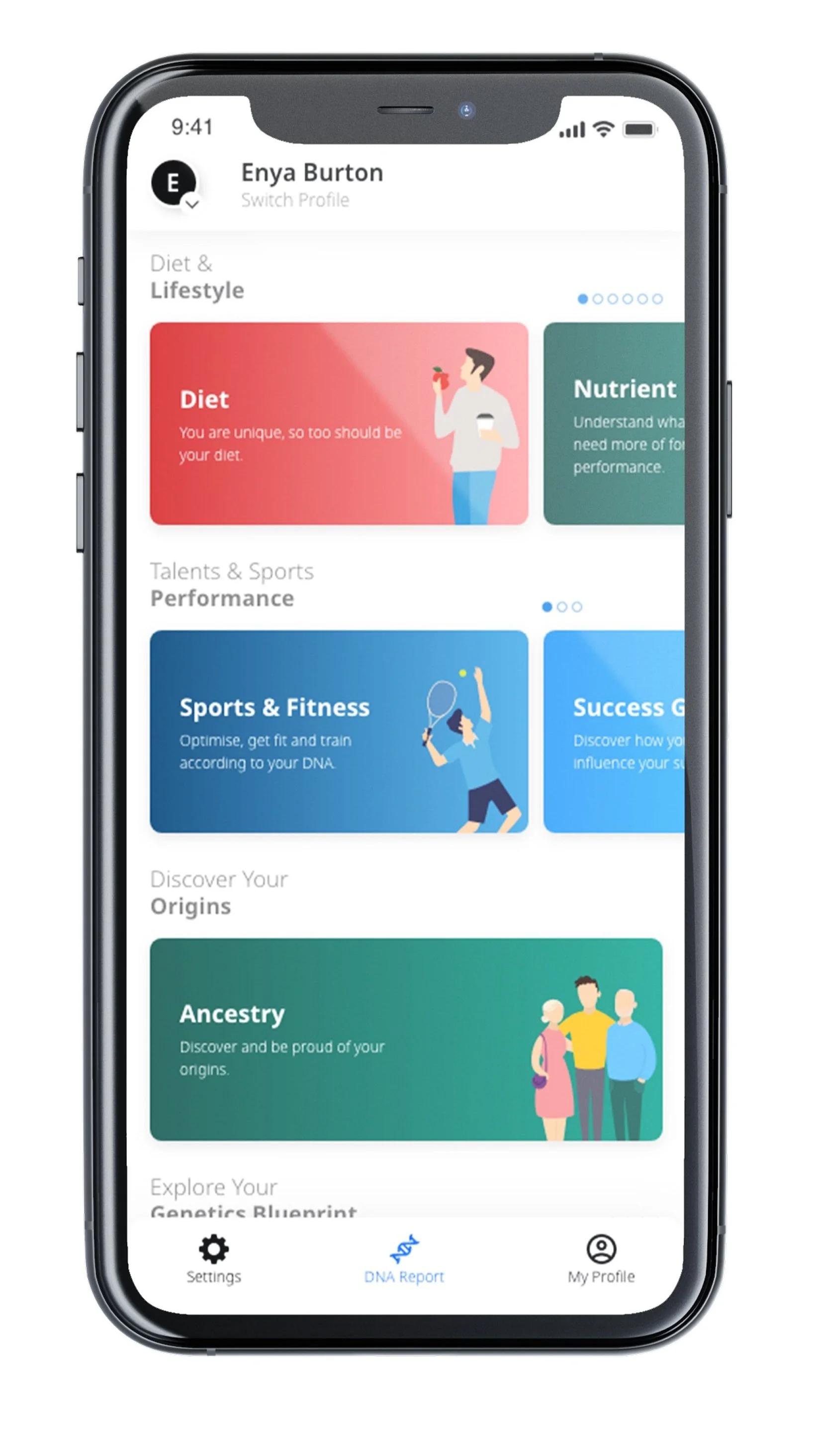
A bottom navigation has been added for fast access to the settings page, dashboard (DNA report) and profile page.
The top navigation now only relates to profile, which includes two actions: switch profile and add profile.
A carousel has been added to indicate exactly how many cards there are in a section if there is more than one.
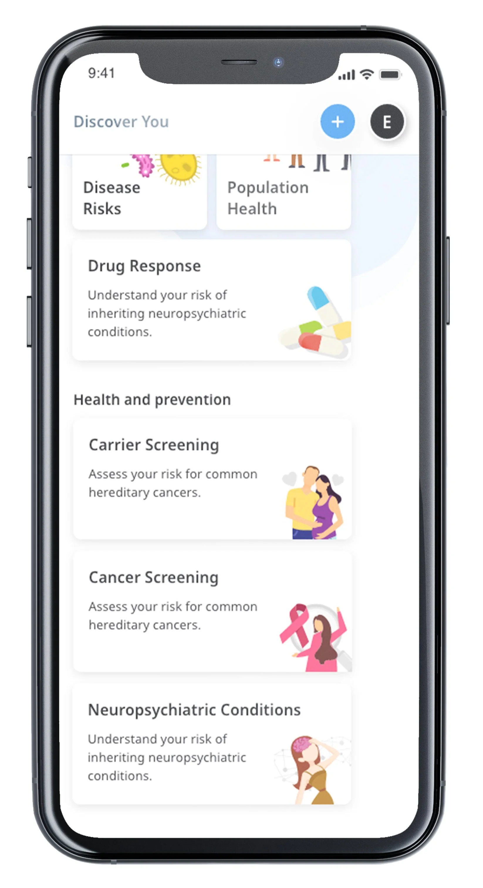
The clinical tiles are laid out for the purpose of having them being easily accessed due to the information/results they contain. A personal request from the CEO.
Motivation to upgrade
Users can now see all available and locked topics on their dashboard.
When a user doesn’t have a premium plan, they can easily upgrade.
Goal No. 2
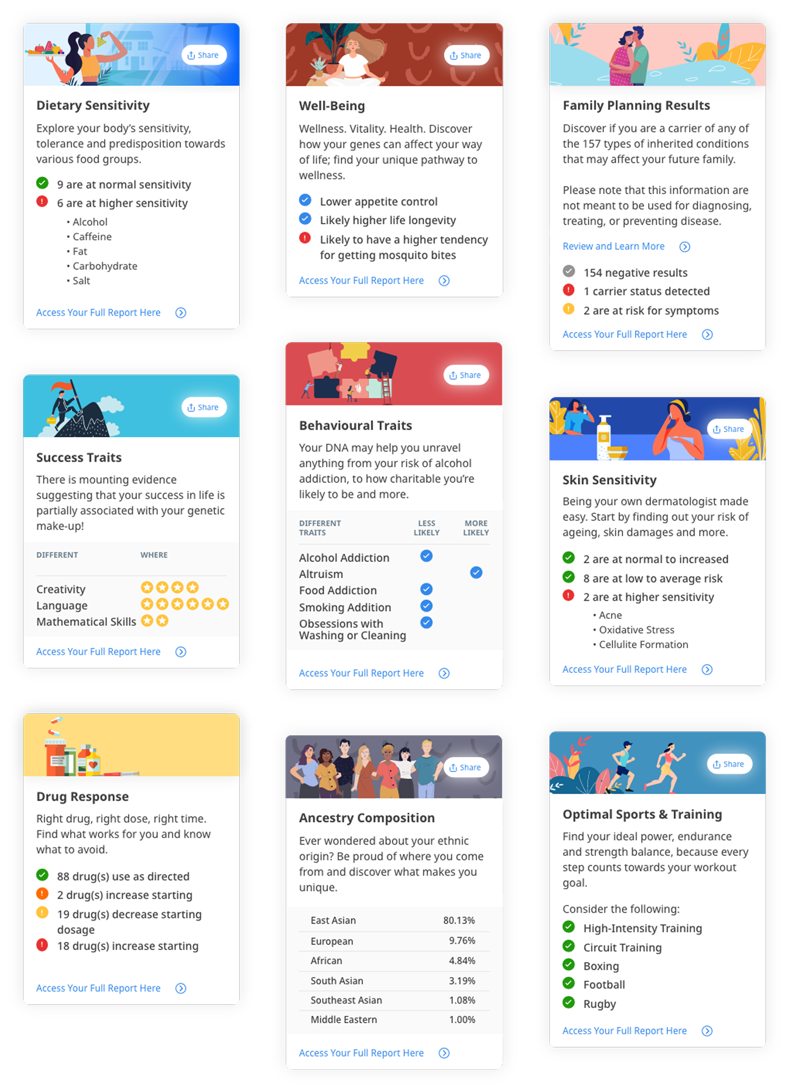
Design the report summary into shareable social media-friendly tokens The report summary as the name suggests is the summary of 500+ reports.
It shouId contain vital information that can be easily skimmed through by a user to obtain high-level information.
The Premium plan contains 20 categories. Each category will have one corresponding card summary in the report summary page. This will include the clinical reports such as disease risks as this information that won’t be viable to share on social media.
Process
As part of research, I had to get quantitative data from our analytics and geneticists team to better understand our customer base. This is to:
Design the report summary card ✨aesthetically-pleasing✨
Ensure no card should be empty for any user
To further explain point number 2, here’s an example:
What’s the percentage of users who do not have ‘gifted’ as a result at all in the Success Traits category? 43.75% of the users do not have ‘gifted’ result at all in the Success Traits category.Formula: There are 9 topics in the Success Traits category. Each topic can have one of the three results: normal, excellent or gifted. 100% of users in our database have at least one ‘excellent’ result in the Success Traits category. Therefore, the card summary should not display a ‘gifted’ result and only show ‘excellent’. ‘Normal’ result isn’t displayed in the card summary as it’s not deemed interesting enough.
I’ve written a Report Summary documentation to gather all the research & analysis, showing the breakdown of categories and topics in each, and explanation as to why a number of card summaries are grouped together and why some cards are designed completely different. You can view here.
Unfortunately, the Report Summary feature was put on hold and has been put into the backlog as other priorities under the Prenetics product portfolio were prioritised. Nevertheless, I’ve enjoyed working on this as I’ve learned more about what goes behind the scenes on how genetic results are translated and had the chance to work closely with our in-house geneticists. In addition, I worked closely with a Business Analyst where I learned how to write engineering tickets with clear acceptance criteria.