EQONEX
Redesigning Accounts & Portfolio
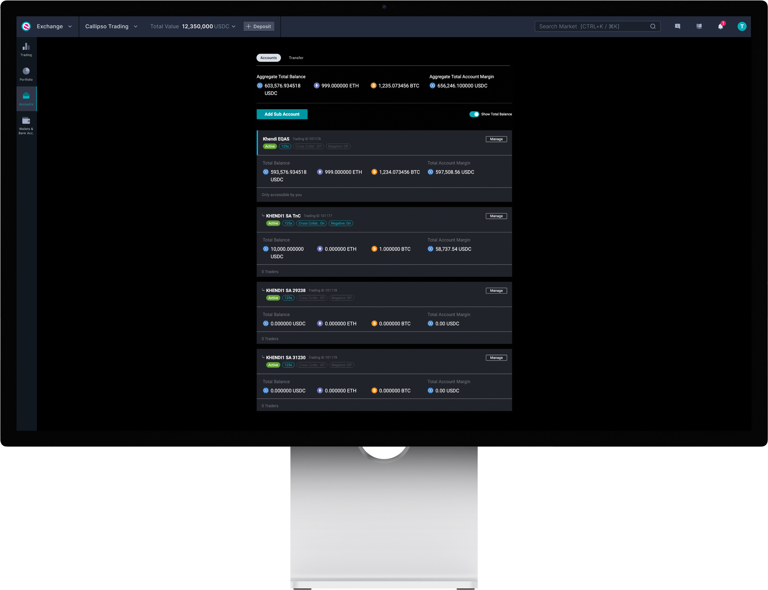
EQONEX is committed to helping traders manage their risk as effectively as possible, and has launched the Sub Account feature in July 2021. With this structure, it allows traders more flexibility to distribute their funds and/or isolate positions to manage their portfolios efficiently.
It’s the ability to put specific assets into Sub Accounts, and trade that Sub Account as a segregated bucket of risk relative to the rest of their asset base. Users can open up to six Sub Accounts on top of their Main Account.
Role
Design Lead
Discovery & ideation, design & restructure, testing & prototyping
Team
1 Head of CX & Design
2 Product Managers
1 Business Analyst
1 Tech Lead (Frontend)
Platform
Desktop
Account’s page legacy design & structure
Portfolio page’s legacy design & structure
What is the problem?
EQONEX currently has an Accounts page and a Portfolio page using the legacy design and structure. With the current split between the two leads to redundancy without sufficient differentiation.
As a result, there is confusion and lack of clarity and orientation for administering sub-accounts and transfers, which distracts from trading. This begs the question, is there really a need for both pages to exist? Or does it make sense to merge into one?
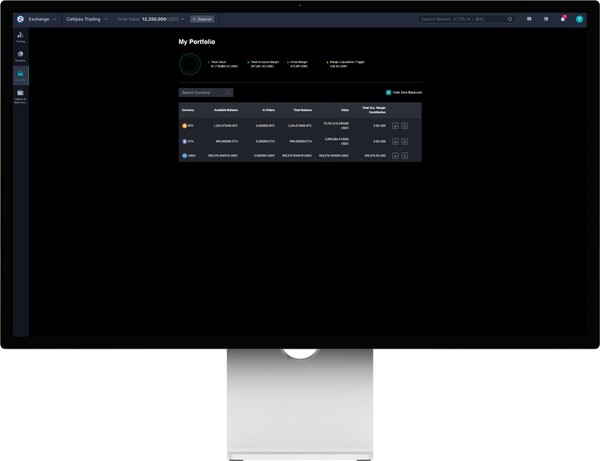
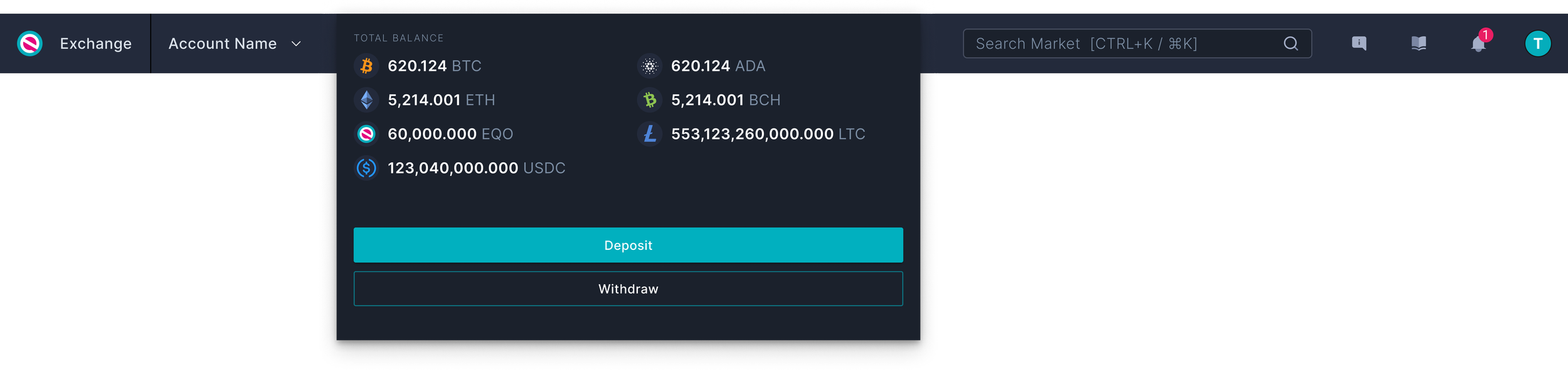
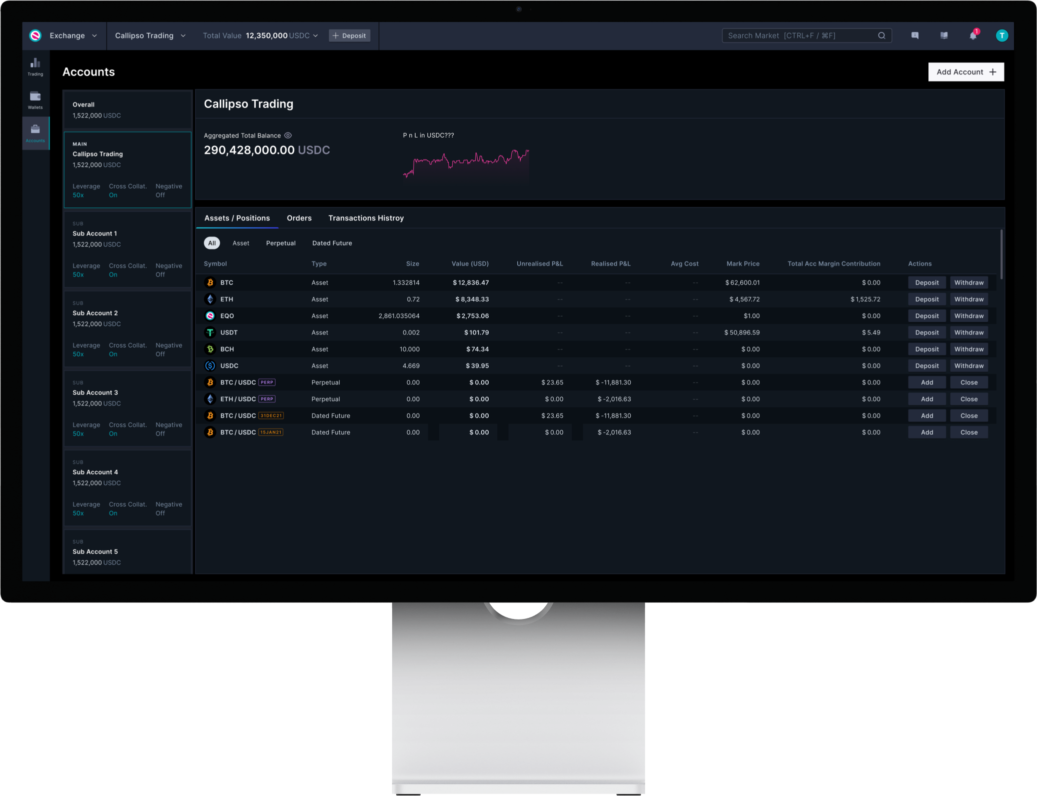
With the revamped global top navigation, a user can immediately see the total value on the account they are on. This amount can be found right next to the account name. When a user hovers over this section, it displays the total balances of the assets in that account.
Upon going to the Portfolio page, it’s the same information plus other balances (e.g. Margin Liquidation Trigger, Initial Margin) that are not not considered key information for the Portfolio page. It makes mores sense to see these balances on the Trading page (verified by our product owners/experienced traders).
Between the Accounts page and Portfolio page, there are overlapping information and features. It’s as if the information you see on the Portfolio page is simply a subset of the Accounts page.
Research
Determined to make the new Sub Accounts feature work the way users want, I have conducted user interviews and usability testings with our Head of Product and Head of Strategy & Delivery who are both experienced traders. Let’s name the two Lily and James respectively to make things easier.
Lily personally doesn’t use the Accounts page because it doesn’t really give her much value. She wants information that better helps her evaluate her account(s) performance. This is to know which account to trade from and/or whether there’s a need to a transfer. This makes her a perfect candidate.
James is someone who has multiple sub accounts in which he trades from quite frequently. The current structure doesn’t work well with him because it takes too long to get the information he wants to know, which then slows him down to take the necessary actions. So, James knows what doesn’t work for him at all. Plus, “when done right we don’t really need a separate Portfolio page and an Account page”.
Goal
Platform Goal
To merge the Portfolio & Account pages into one.
User’s Primary Goals
To view and compare account and asset balances
To transfer balance across different accounts
To manage account settings
To check P&L performance for 24 hr & Total Position (Note: not for Day 1)
User’s Secondary Goals
To view assets by product type
To view relevance balance according to product type
To sort by value, name and underlying
Usability Testing
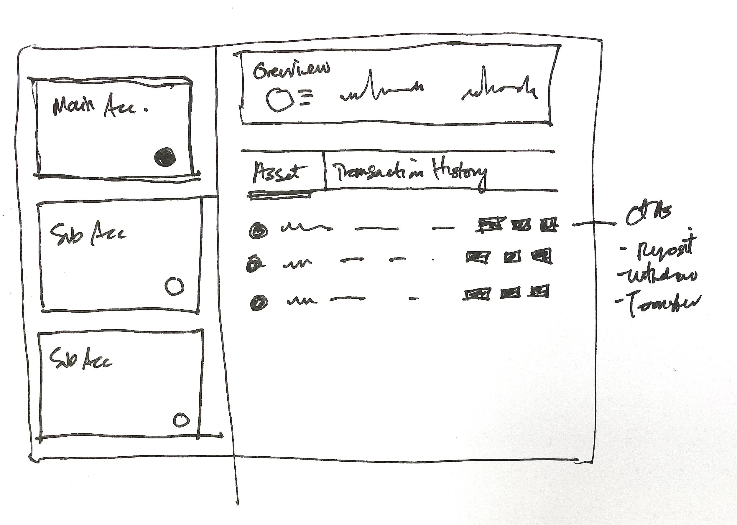
I have experimented with various structures. Here are the options:
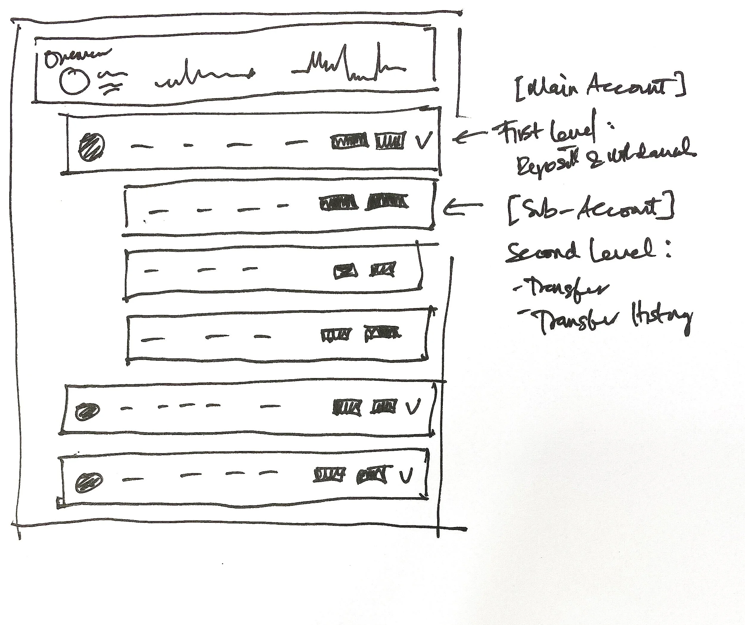
Group by assets with an accordion structure
PRO
One-click to making a transfer because user doesn’t have to specify the asset of choice, just the account destination
Can easily compare asset balances across accounts
CON
Comparing accounts can’t be done with ease
Having to expand and collapse to view more information
Not mobile-friendly, would require simplification and a change in structure

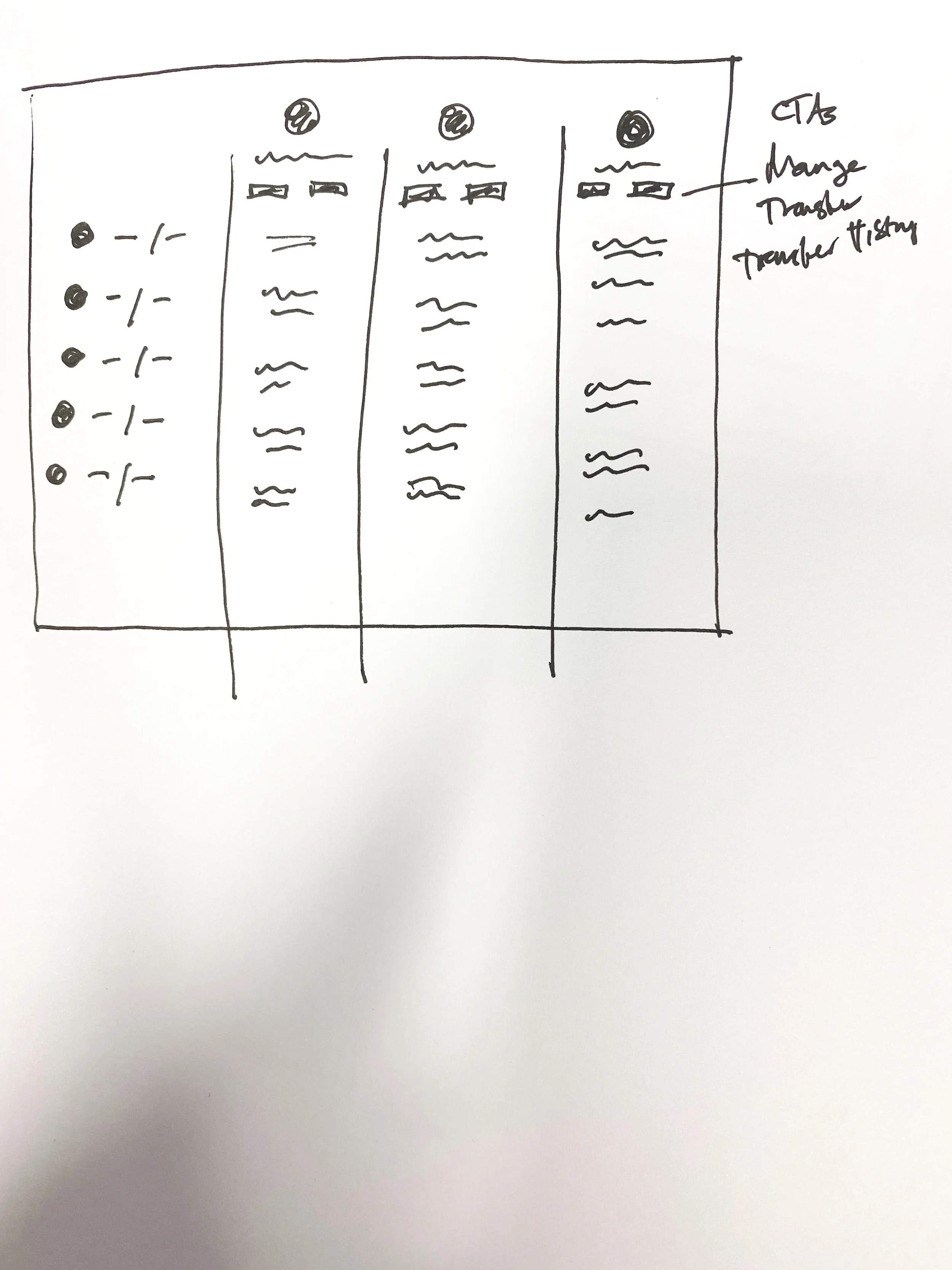
2. Group by account
PRO
Scalable as it has the capability of handling more feature rollouts and permission controls
CON
Comparing accounts can’t be done with ease
Orientation requires learnability as it has a multi- layers of information
Not mobile-friendly, would require simplification and a change in structure
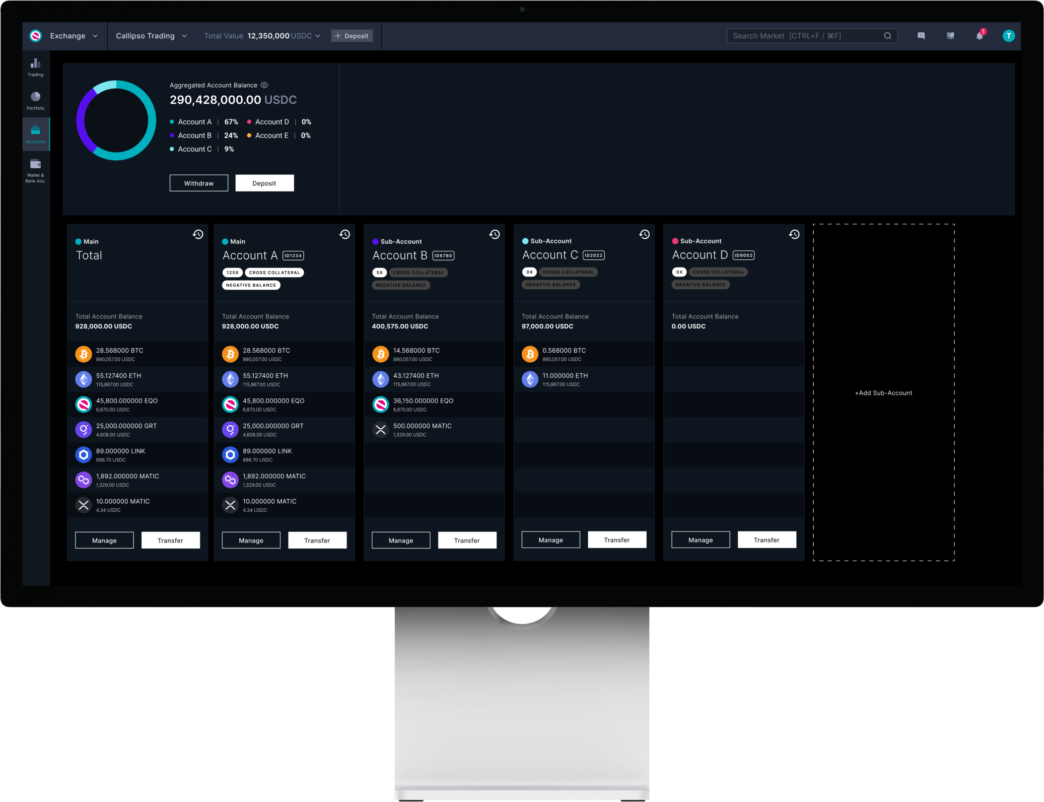
3. Excel sheet view
PRO
Simple yet fulfils all goals efficiently
Lowest tech effort in comparison to the other two
High orientation
Minor adjustments for a mobile view
CON
Is not scalable if in the future we allow more than 6 sub accounts
CTAs are compromised when the screen is smaller
Findings & Approach for Day 1
I’ve shared these options with James, Lily, Business Analyst, and the UX team. After having shown the options above with them, we all agree that option no. 3 is the best approach to which we moved forward with. Below screens of the the fine-tuned version:
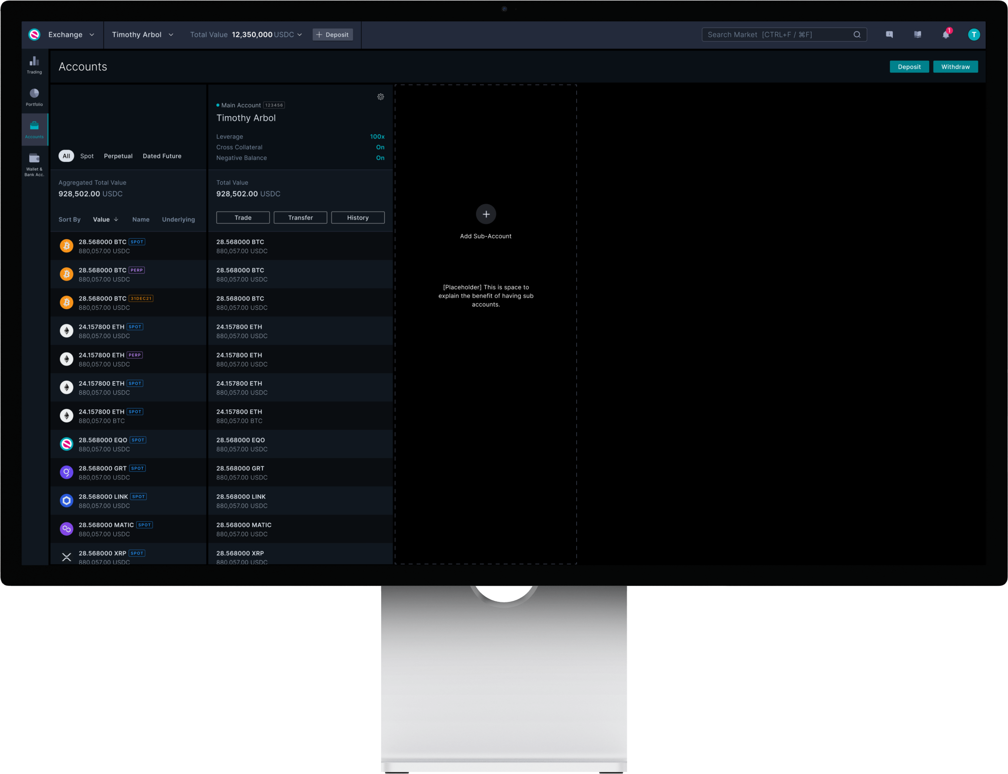
Default state of the Accounts page
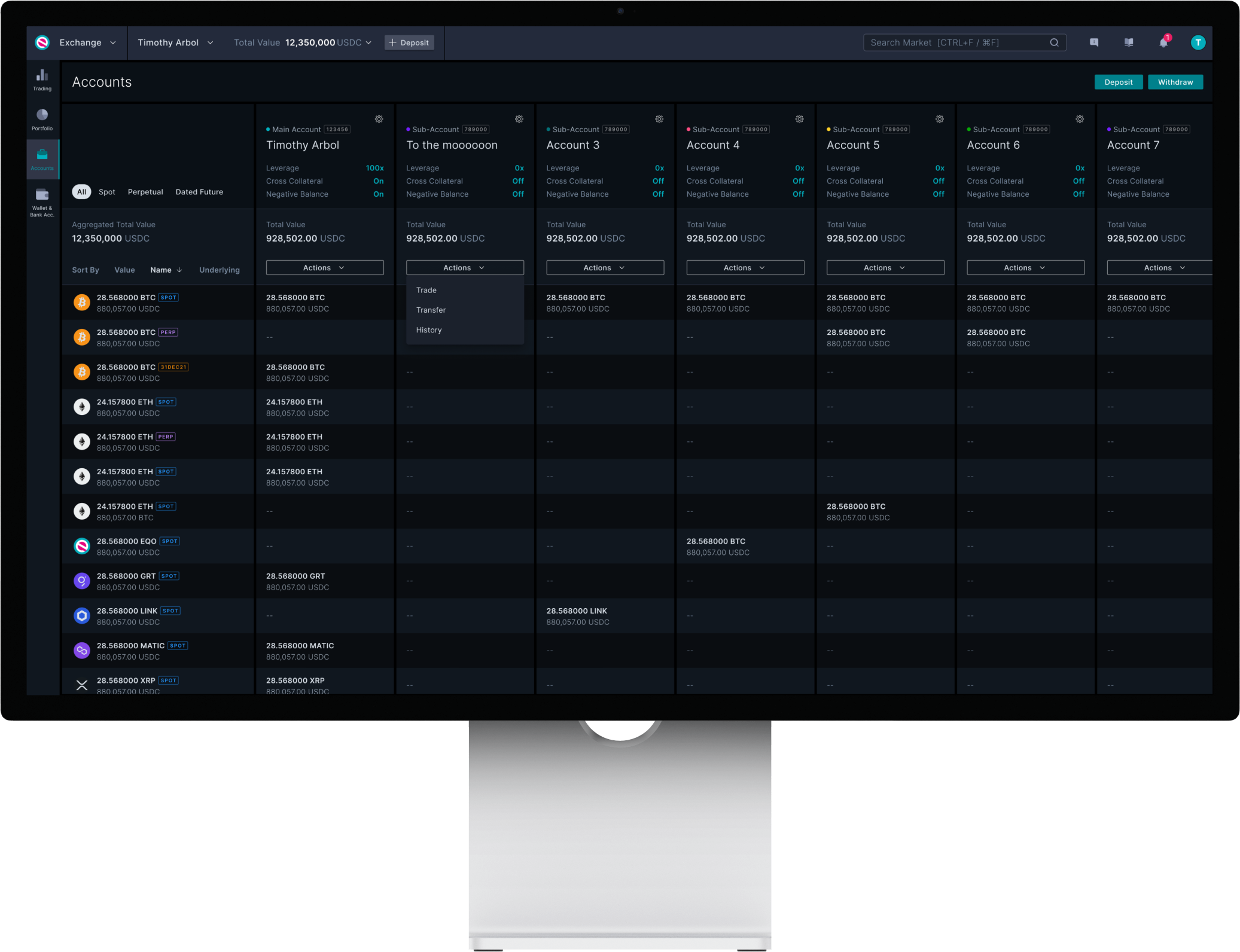
Maximum amount of sub accounts on the Accounts page
High-fidelity and handover to Dev
Once the Account page has been fine tuned - I’ve scheduled a Demo with the Dev team, QA team and the BA before it got groomed. It was also an opportunity for everyone to ask any questions e.g. expected behaviour (scrolling), states, edge cases and so on.
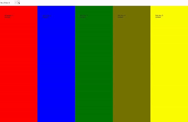
Expected responsive behaviour of the sub account columns. Has a maximum width at its default state with just the Total Aggregated Balance column and Main account. Upon adding a sub account, the columns will adjust responsibly based on the size of the screen. There is a set minimum width for the columns and when the screen is too small, there will be a horizontal scroll.
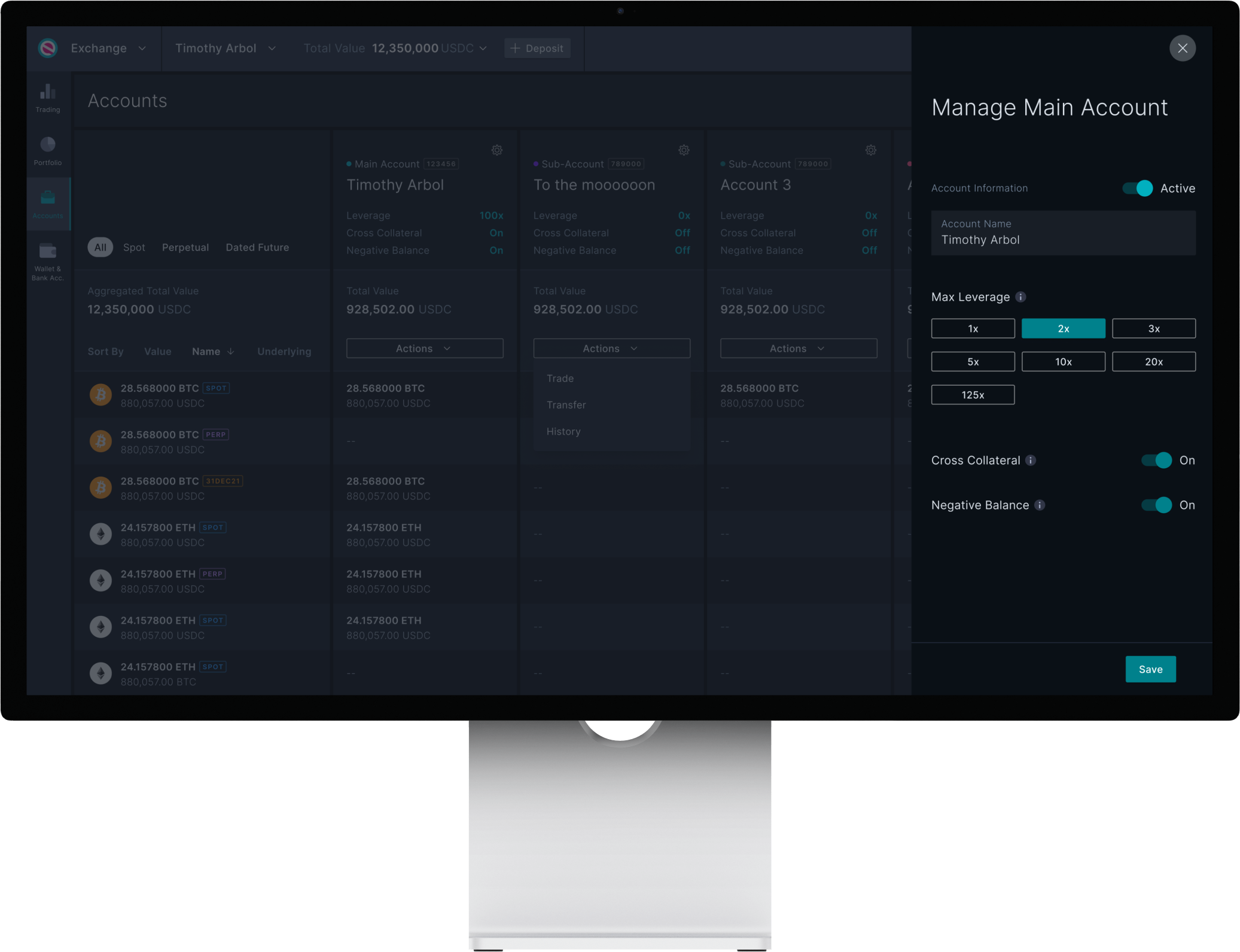
Manage Account - Drawer
Transfer Balance - Drawer