EQONEX
Restructuring Deposits & Withdrawals
As any Exchange, on-ramps are the gateway into the ecosystem. EQONEX only had USD bank transfers as the only option. Using Clear Junction as a provider, we’ve now integrated GBP and EUR currencies for bank transfers. In addition, we also support credit and debit card payments. It’s fundamental that we ensure that Deposits & Withdrawals have a seamless user experiences.
Role
Design Lead
Discovery & ideation, design & restructure, testing & prototyping
Team
1 Head of CX & Design
1 Product Owner of D&W squad
2 Business Analysts
1 Tech Lead (Frontend)
Platform
Desktop
Mobile app
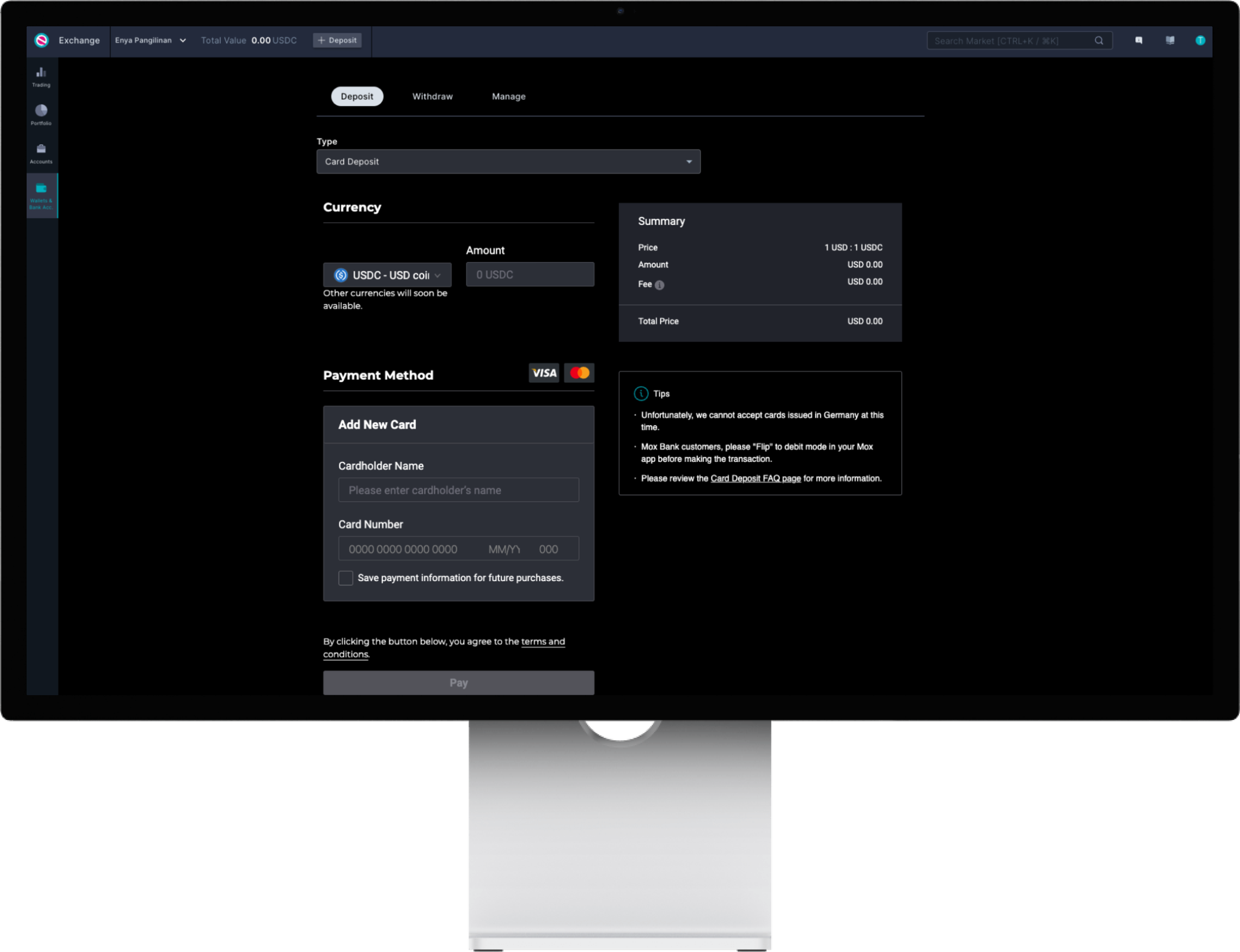
Deposit via Card Payment

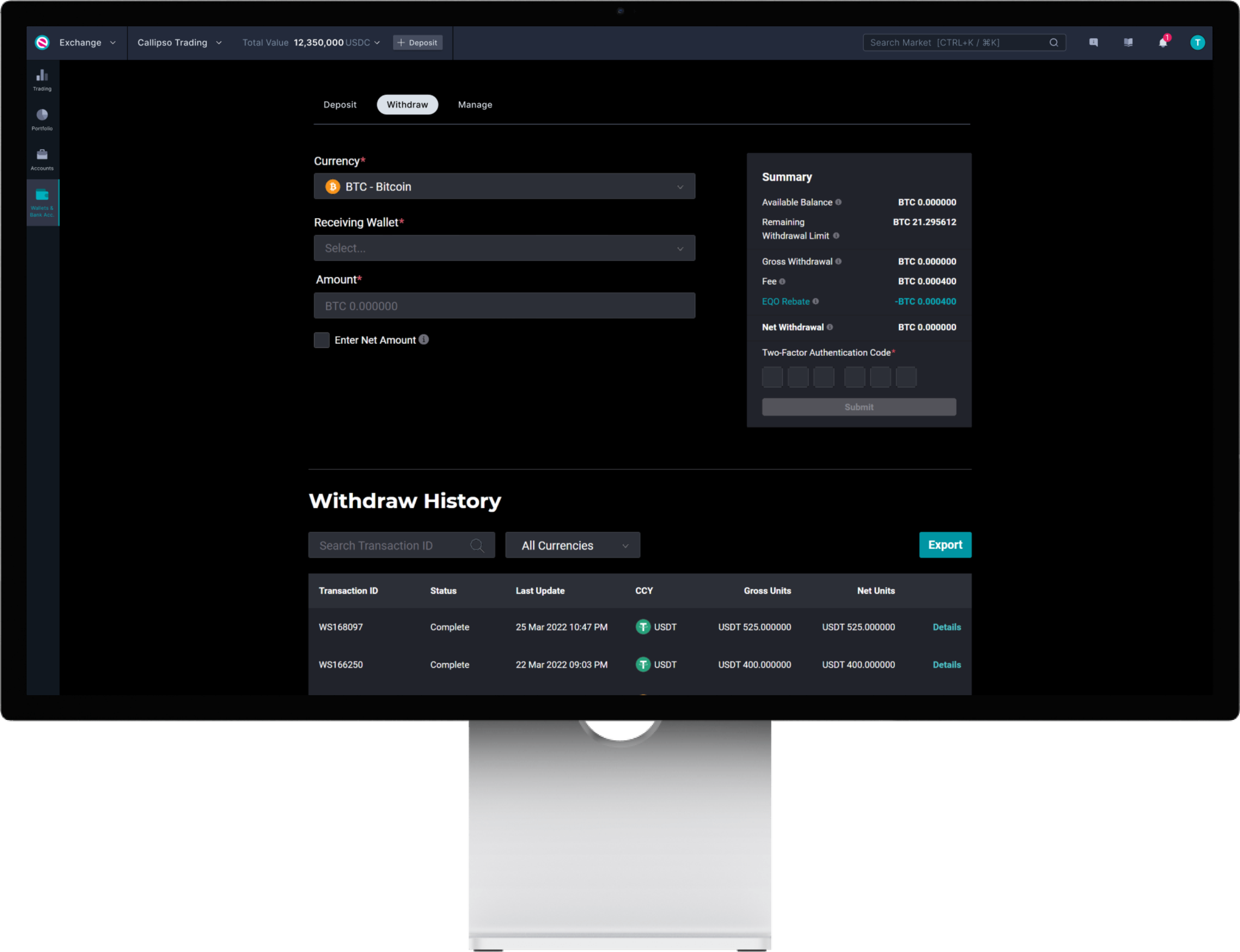
Deposit via Bank Transfer - pending bank account
What are the problems?
Lack of orientation due to inconsistency and clutter
When a user is on the Deposit tab -> selects Bank Transfer but has no bank account yet, clicking on `Add Bank Account` will switch them to the Manage tab where they fill in the details. However, when they `Add a Debit/Credit Card` they retain on the same tab and not switch to the Manage tab.
Problematic hierarchy of information as it’s not intuitive enough in guiding the user to complete the task easily.
UI is all over the place which disrupts legibility.
Deposit prompts user to select method first, however, for Withdrawals user is prompted to select currency first.
Irrelevant information are displayed e.g. “Unfortunately, we cannot accept cards issued in Germany at this time” when this is only applicable to less than 5% of our existing users.
Lack of user confidence
Due to the lack of orientation, it requires the user to learn the process instead of simply completing the task in a flash.
There is no `Review` step before clicking `Pay` when making a credit card transaction so a user would have to check the summary section thoroughly. With the reasons stated above, this leads to a lack of confidence, which results to a slow success rate. This becomes more apparent when a user makes a large transaction.
Omnichannel experience can’t be achieved
As the desktop version is already problematic, the same issues will be carried over if we were to implement the same structure on the mobile app.
Goal
Faster Deposits
How?
Achieve high orientation
Create omnichannel patterns between web and mobile app
Improve user confidence
My Role
In line with the Product Roadmap, the updates on the legacy design for web was in development phase at the time when I started the Deposit & Withdrawal project. This was when I was also working on the EQONEX mobile app (MVP version).
I had to tackle this head on with an omnichannel experience in mind. Since I’ve been leading the mobile app project and concurrently working on the Exchange, this project helped me bridge the gap and set presidence moving forward for Non-Trading features/pages of the Exchange.
Approach
Was excited for the challenge! I knew the legacy design structure wasn’t optimal for the mobile app so I decided to revamp Deposit & Withdrawals mobile first and then scale up.
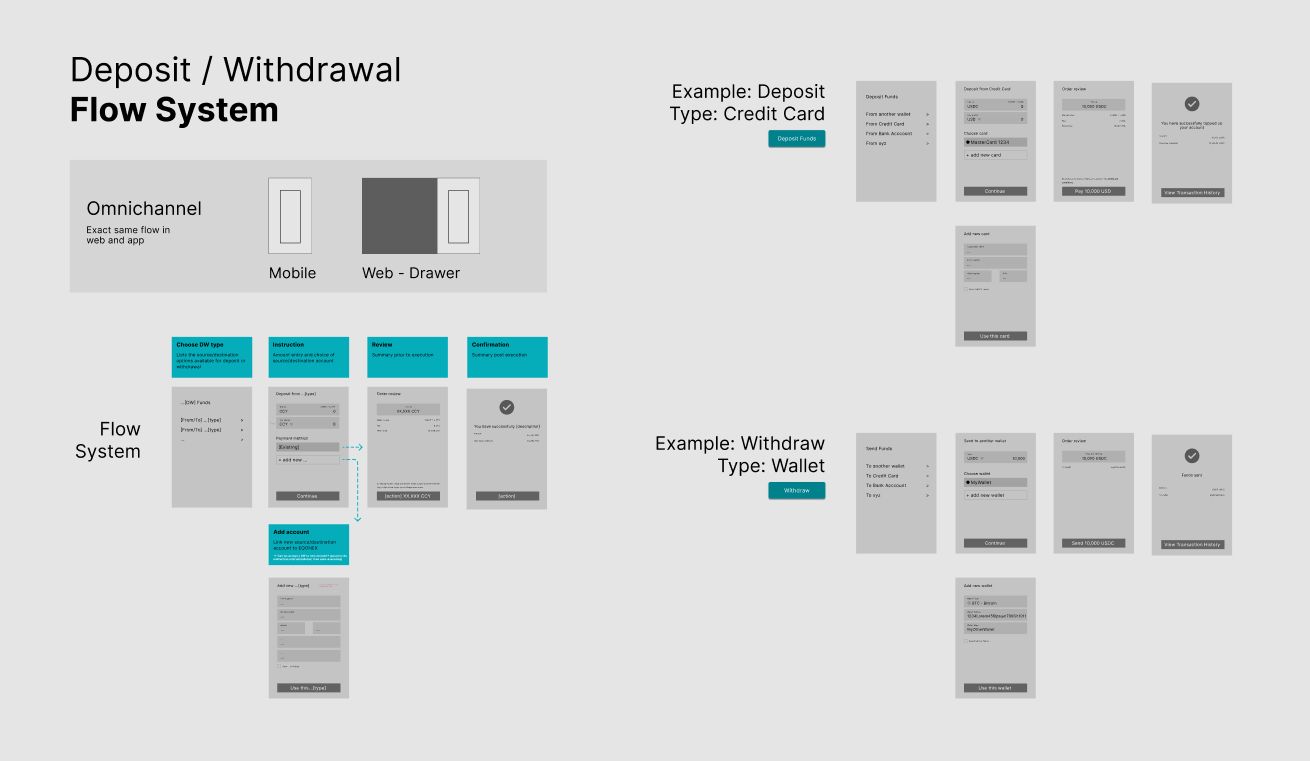
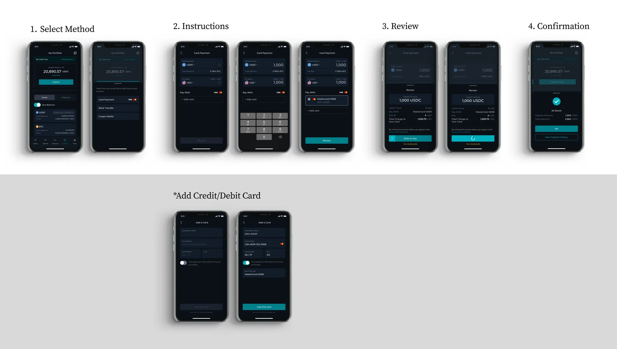
With all the points listed above in the Considerations & Challenges section, this is the 4-page flow system I’ve set up for the Deposit & Withdrawal, which aims for a flexible, scalable and systemic approach. The 4-page flow system:
Choose Deposit/Withdrawal Type
Instructions
Select Currency
Enter Amount
Select Payment (Card Deposit)
Select Bank (Bank Transfer Deposit & Withdrawal)
Add (No existing card or bank)
Review
Confirmation
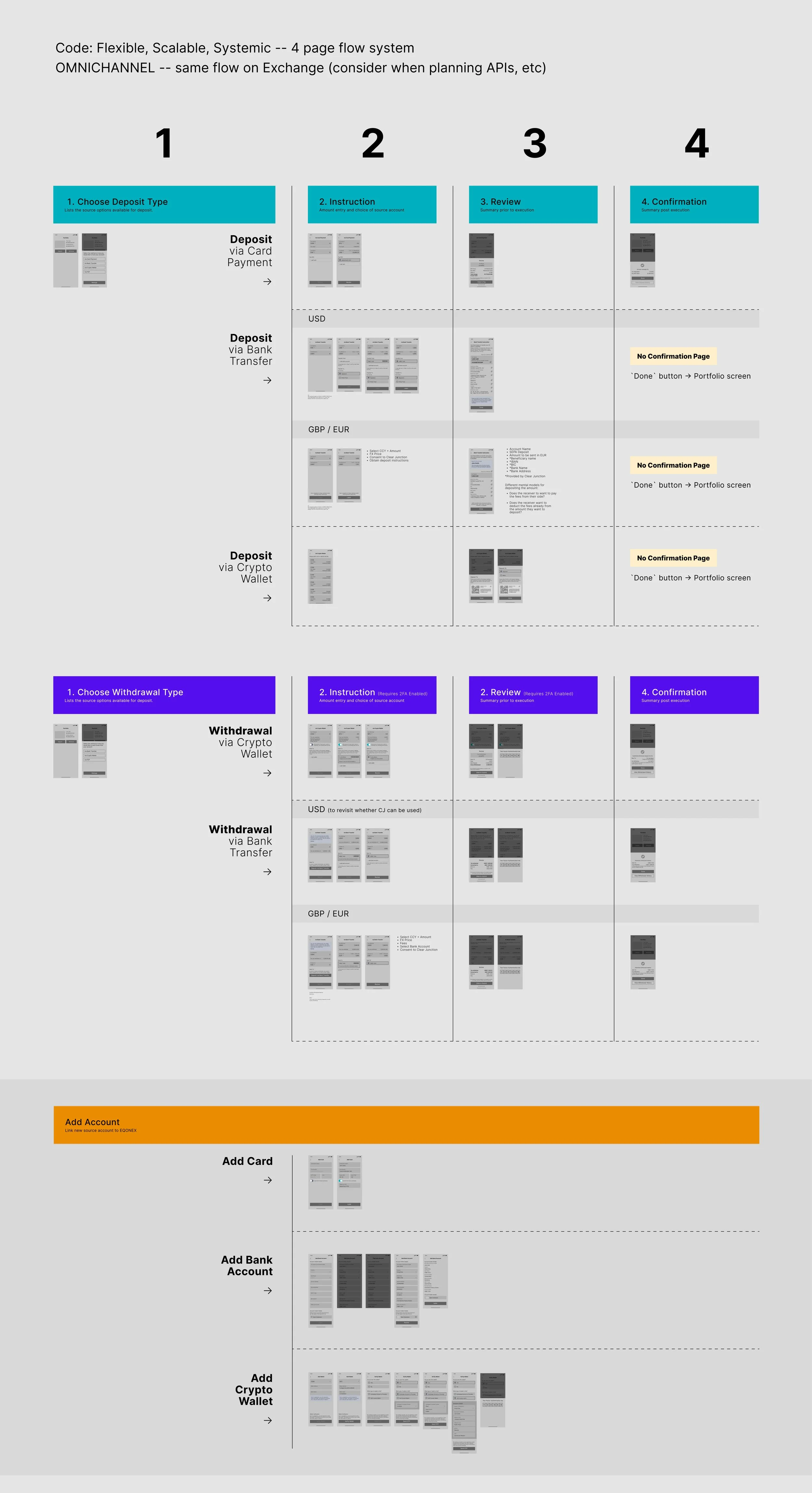
Considerations & Challenges
Leading this project, I worked closely with the Product Owner and Head of Design — here are essential points about the EQONEX Exchange that I needed to consider when building the new Deposit & Withdrawal workflow:
Deposits
Holding
The platform does not hold any fiat wallets.
Any fiat currency deposited will automatically be converted into the base currency the user has selected on their account, which is either USDC or USD.
Adding
A debit/credit card is not saved until successful transaction.
There’s no need to add a bank account when making a EUR or GBP bank transfer but a USD bank transfer does.
It takes 3 days to verify a bank account.
Accounts
A user can only deposit into their Main Account. Transferring balance into their Sub Account(s) can only be done after the deposit is successful. To learn more about the sub account feature on the EQONEX exchange, view case study here.
Bank Transfer
When making a USD bank transfer for the first time, it requires a document verification whereas EUR/GBP does not.
When making a USD bank transfer, the amount stated in the deposit request should match. Otherwise, Ops team would need to manually update the request on the internal portal.
When making a EUR/GBP bank transfer, the name on the EQONEX account and the bank should match as well as the amount stated in the deposit request. Otherwise, if the names significantly mismatch it’ll be marked as `Failed` then Ops team would have to contact customer notifying them the result. The customer will have to make the necessary adjustments, if not the deposit won’t be accepted.
Withdrawals
In order to make a fiat withdrawal with a selected currency, a deposit has to be made first in that currency
The balance they can withdraw is only the value of their USDC asset. If they want to withdraw the balance from their other assets such as BTC, they will need to be traded first.
Process
Deposit Crypto via Credit/Debit Card Payment
Deposit USD via Bank Transfer
Deposit EUR or GBP via Bank Transfer
Designing the omnichannel experience
As the UX team is building the new Design System, we are also in constant discussions about the why’s, what’s, how’s and where’s. For example, in what format should Deposit & Withdrawals be on the Exchange and why?
Does it live in a page?
Is it a hovering flow that is temporary?
Should it be as a drawer? Or a modal perhaps?
With the UI Overhaul Day 1 release, one of the main goals of the new Exchange is to have fast access navigation back to Trading. In order to be aligned with that goal, we want Deposit & Withdrawals to be a hovering flow so that a user can quickly get back to the Trading.
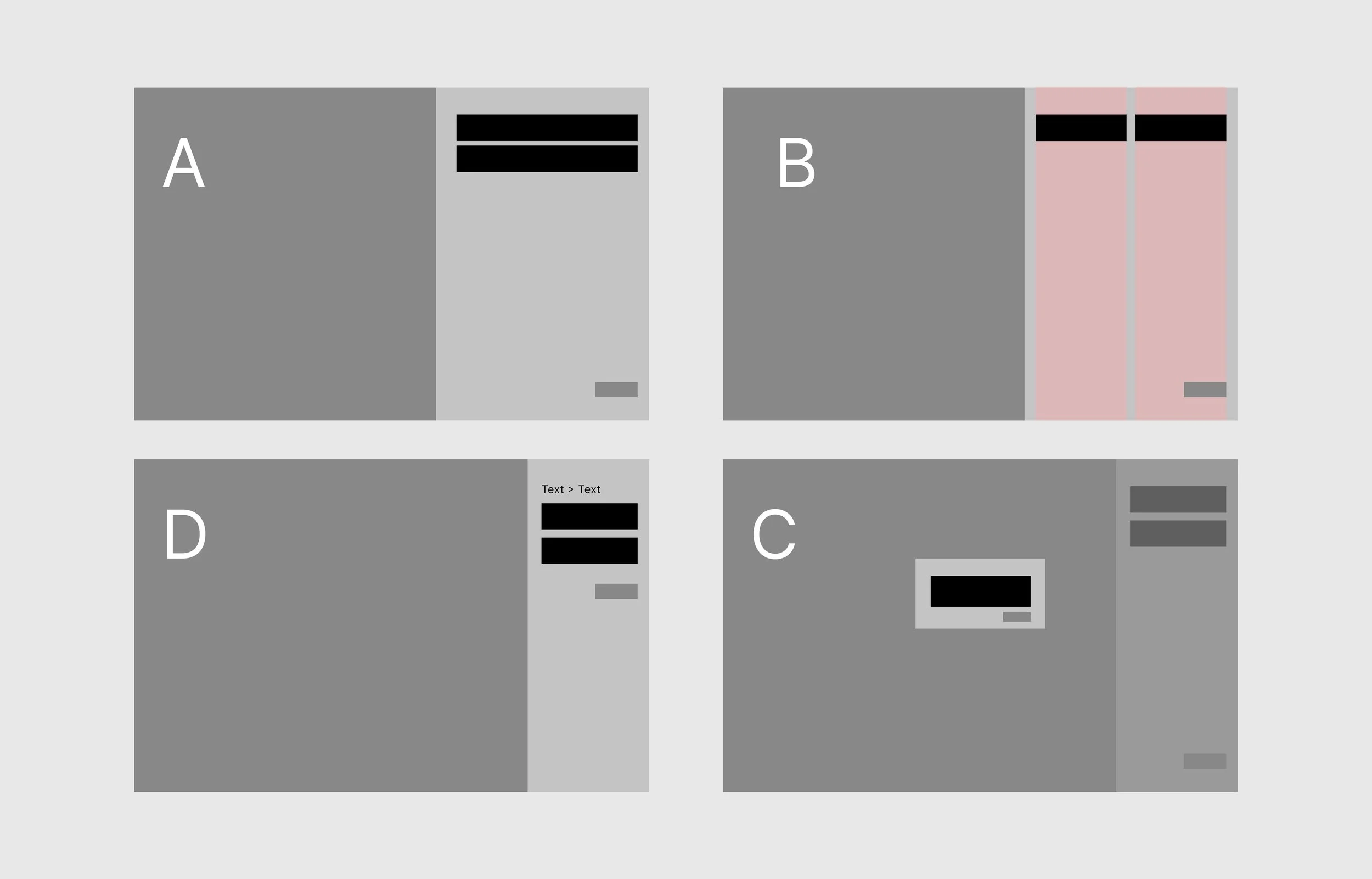
Drawer exploration types
Modal exploration types
Exploration
Now in what format should it be? A modal or a drawer?
Judging Criteria
UX
Clarity / Single-mindedness (what do I need to do)
Error prevention (how easily could I make a mistake - wrong choice, cancel flow)
Orientation (where am I, how do I get back, what’s coming next)
System
Scalability (does this work with any flow that may be a modal)
Omnichannel (does it allow the flow to work the same way in all channels)
Drawer exploration
Multiple prototyping samples of the drawer were done to help us evaluate the experience better.
Small and large drawer sizes
One-action only inside drawer
Multi-level steps inside a drawer
A combination of a drawer with quick action modals
As much as we wanted to make the drawer work, it is not well suited for the Deposit & Withdrawal flow. Why?
Multi-level steps inside a drawer makes the user lose orientation
Accidentally clicking outside the drawer would be an inconvenience
Considering how Deposits & Withdrawals are fundamental flows - making the user fixate only on the right side of the screen:
Does not provide the flow the importance and focus it needs
Loses comfortability for the user in comparison to looking at the centre of their screen
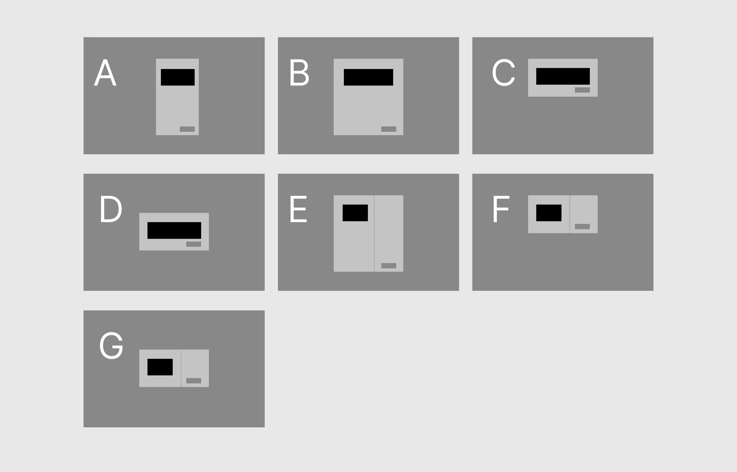
Modal exploration
Multiple prototyping samples of the modal were also done to help us evaluate the experience better.
Fixed mobile-size modal (with scroll when necessary)
Large and medium-sized modal with a left-handside menu
Fixed sized modal that is top-aligned
Fixed sized modal that is centre-aligned
Modal height changes responding to the length of content
Conclusion
After going through the modal prototypes, we’ve come to the deliberation that having the Deposit & Withdrawal flow on a modal made the most sense. We moved forward with Option 3 format and behaviour.
It provides clarity and orientation
It provides focus on the task in hand
Using omnichannel patterns without compromise
It is scalable as it can be used for future multi-level flows
Works well for responsive design as the centre of attention attention does not change when the screen resizes